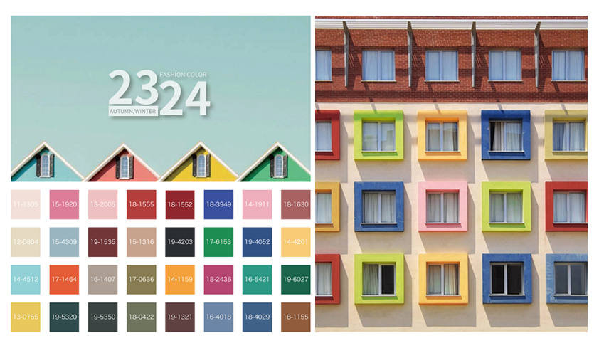
Healing the future -F/W 23/24 women’s bag color matching
Color Overview
In the midst of a challenging epidemic, people are full of expectations and hopes for the future, but at the same time, they are uncertain and anxious to find a balance between positive and pessimistic emotions, and they become sensitive to overstimulation and will look for environments and colors that can lower their brain’s anxiety and stress levels. F/W 23/24 colors combine the natural colors of comfort and healing with the dazzling and bold colors of richness. The F/W 23/24 color palette combines comfortable, healing natural colors with dazzling, bold, rich colors for a more understated approach to moody visuals
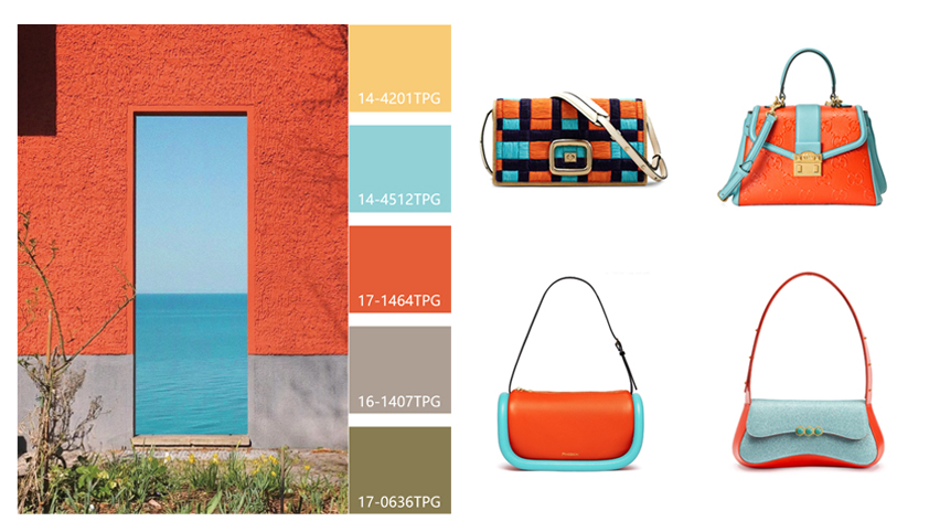
Color Matching (1), Porcelain Blue + Orange Red
Orange red becomes a bright color in autumn and winter, like the warm sun shining in winter, injecting a reassuring positive energy. Paired with the fresh porcelain blue, it retains the premium texture of orange while having the light and pure porcelain blue, colliding with an unexpected dynamic beauty.
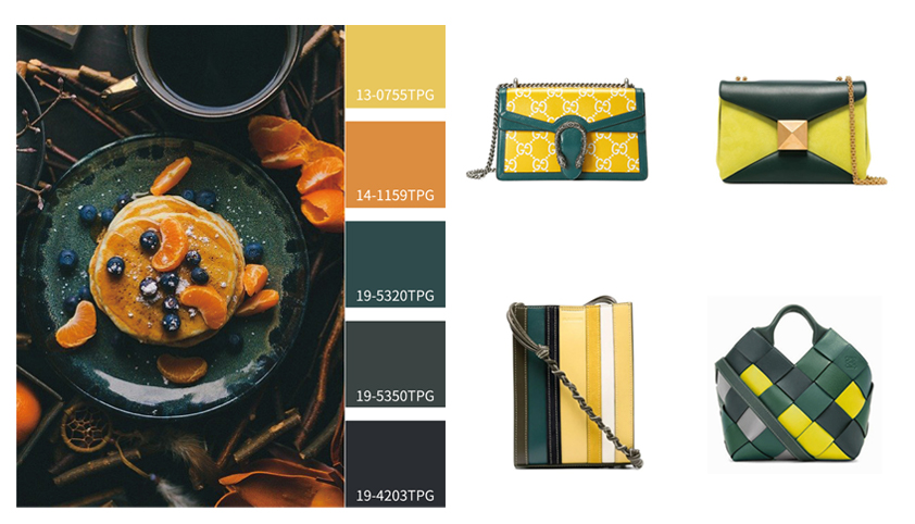
Color matching (2),Yellow pine green + evening primrose yellow
Green gives unlimited security feeling, more colorful in autumn and winter, extracted yellow pine green as the main color, although not pure green bright, but well reconciled with the transition between summer and autumn, with evening primrose yellow and light yellow, so that the colors collide and blend with each other, enjoy the color brings activity and tranquility.
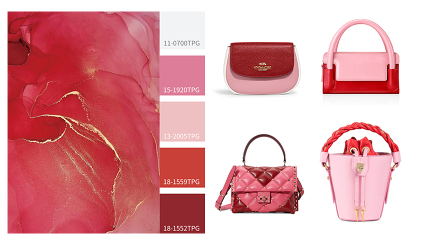
Color matching (3), Alarm Red + Strawberry Cream Powder
A passionate and energetic alarm red expressing the strongest emotions. The sweet strawberry cream pink exudes gentle sweetness. The combination of the two together, pink and red, dreamy and sweet. By adjusting the color ratio, different effects are presented, injecting a romantic atmosphere into the sluggish autumn and winter.
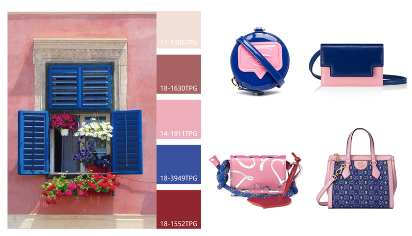
Color matching (4), Dazzling Blue + Candy Pink
Highly saturated dazzling blue presents a bright and vibrant tone, full of dynamic energy; with the gentle and sweet candy pink, a very contrasting sense of color to form a strong contrast, giving the bag an elegant and high fashion temperament. Can also be expressed through different materials, patent leather more street sense, denim fabric is more vintage.
Color matching (5), sea green + blush rose
When the gorgeous blush rose meets sea green collision, and then with black as a transition color, it will make people feel like being in a fairy tale like a good feeling. Refreshing sea green makes the blush rose more charming and dynamic, and the partial embellishment on the bag, bright and light, but not too flamboyant, the beauty is just right.
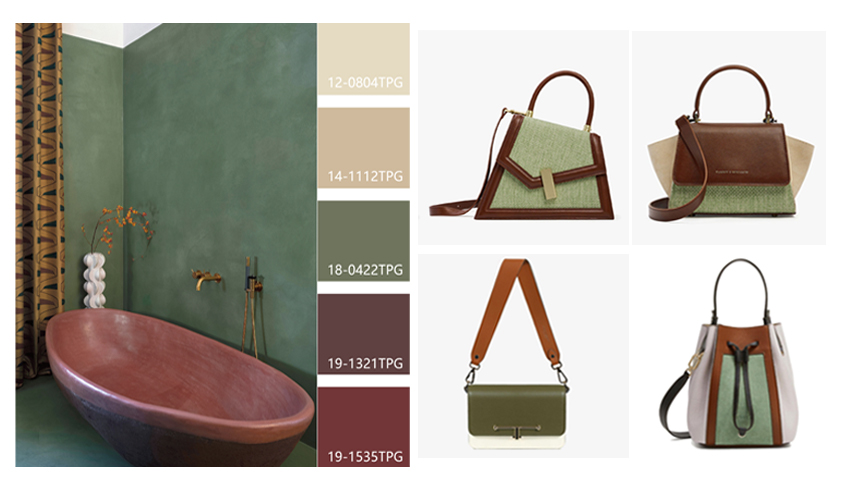
Color matching (6), Loden Green + Pebble + Syrah Wine Red
Green tones and brown tones, an eco-friendly color derived from natural resources, will continue to take the market by storm. The comfortable and pleasant Loden green as the main color, together with pebbles and Syrah wine red, brings a unique nature tone, which can bring a relaxed and pleasant feeling. Through the natural and simple materials can highlight the high quality, creating a cozy and comfortable atmosphere full of winter.
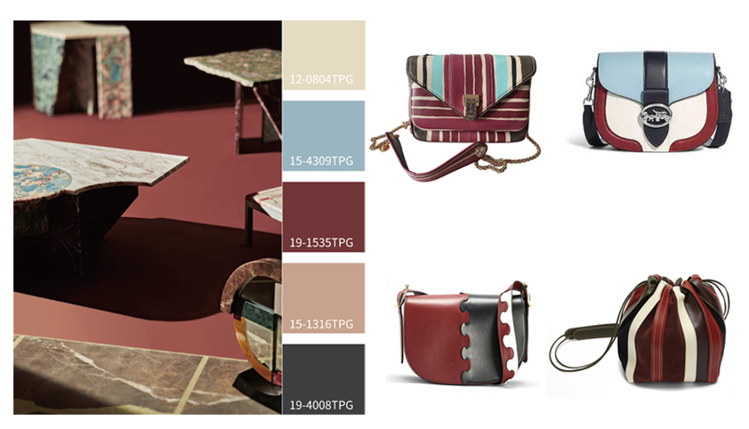
Color matching (7), Syrah red + cloud frost white + fog blue
As a set of warm, comfortable and durable all-neutral color scheme, the combination of rich Syrah wine red and cloud frost white shows the beauty of understated luxury, making it a perfect match for autumn and winter. Misty blue as a small area of color accents, to enrich the layers of the bag, to break the autumn and winter dull dull.
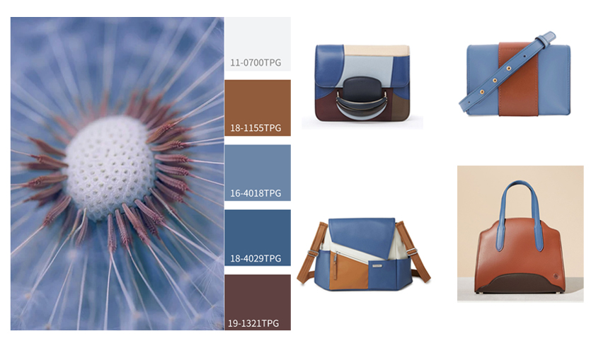
Color matching (8), Ashley Blue + Marzipan + Rum Red
The marzipan brown base brings a sense of calmness and ease, the appearance of Ashley blue makes people bright, the natural articulation of blue and brown, soft tones bring a quiet and gentle noble temperament. The addition of rum red brings the texture of autumn and makes the whole more senior and charming.
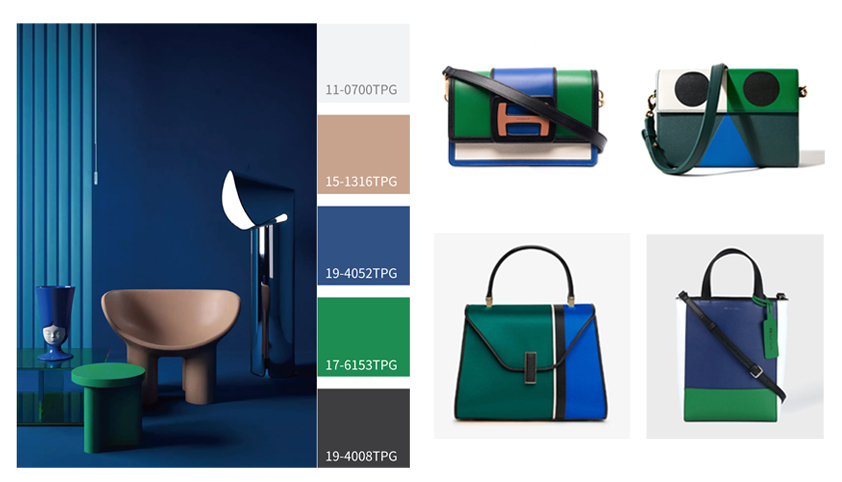
Color matching (9), classic blue + fern green
Classic blue and fern green belong to the same cool color, giving people a calm and quiet visual feeling, showing both a powerful and refreshing effect.The rich and fresh color combination, and then black, white and other colorless color as a separate accent, so that the bag shows the charm of fashion.
Color matching (10), moonless night + fishtail chrysanthemum
The mysterious and advanced moonless night is the main color, and the eye-catching and passionate fishtail chrysanthemum color is interspersed throughout, creating a sense of steady and lively atmosphere. Through clever cutting and splicing, introversion and flair are effectively balanced to bring about a highly infectious piece.